Keller Williams Realty
https://www.buyhomesincharleston.com/blog/charleston-sc-residential-real-estate-market-update-2018-in-review
Charleston, SC Residential Real Estate Market Update - 2018 in Review
Posted By: Alan Donald In: Real EstateDate: Fri, Jan 11th 2019 10:31 am
Charleston, SC Residential Real Estate - What Happened in 2018?
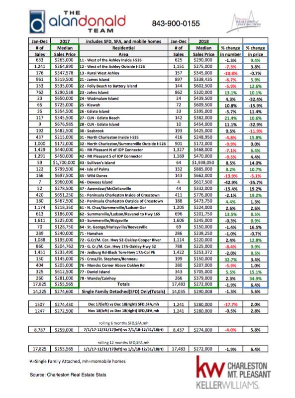
Overall, 2018 was the second busiest year ever for Charleston in terms of number of residential real estate transactions. As shown in the summary chart (click on it for a larger display), a total of 17,483 transactions were recorded on the MLS in 2018. This level was just 1.9% shy of the record level of 17,825 established in 2017.
Median Sales Price
The Median Sales Price increased 6.4% from $255,565 in 2017 to an all-time high of $272,000 for 2018 (see table). The first graph below shows the Median Sales Price (12-month average) since 2004. Note that the prices do not match between the chart and the graph because the graph also includes land, fractional ownership, boat slips and other types of property, while the chart only covers single family detached, single family attached and mobile homes.
It is important to note that, although the median price is going up swiftly, according to a regression trend line of prices since 1991 we are still a little UNDERVALUED (click image to enlarge).

MLS Area Analysis
The following MLS areas experienced the highest annual growth rates for the number of Transactions in 2018:
- 75 - Cross/St. Stephens/Bonneau (32.7% growth rate)
- 27 - CLN - Edisto Beach (21.4%)
- 62 - Summerville/Ladson/Ravenel to Hwy 165 (13.5%)
- 23 - Johns Island (13.1%)
- 44 - Isle of Palms (excluding Wild Dunes, 8.2%)
- 77 - Daniel Island (5.5%)
- 52 - Peninsula Charleston Outside of Crosstown (4.4%)
While these MLS areas saw the greatest annual rates of decline in the number of Transactions in 2018:
- 45 - Wild Dunes (-13.9%)
- 13 - Rural West Ashley (-10.8%)
- 32 - North Charleston/Summerville Outside I-526 (-9.9%)
- 42 - Mount Pleasant South of IOP Connector (-9.5%)
- 73 - Goose Creek/Moncks Corner-Hwy 17A-Oakley-Hwy 52 (-8.4%)
- 12 - West of the Ashley Outside I-526 (-7.3%)
- 41 - Mount Pleasant North of IOP Connector (-7.1%)
Note that some of these declines can be explained by low inventory, and some to the fact that 2017 was a strong year. Plus, December 2018 had 17.7% less transactions than December 2017. The coinciding drop in the stock market may have impacted this. Up until December, 2018 transaction levels had been remarkably close to those in the previous year.
In these MLS areas, the Median Price grew significantly from 2017 to 2018:
- 78 - Wando/Cainhoy (34.9%)
- 51 - Peninsula Charleston Inside of Crosstown (19.2%)
- 31 - North Charleston Inside I-526 (15.8%)
- 77 - Daniel Island (15.1%)
- 72 - Goose Creek/Moncks Corner Hwy 52-Oakley-Cooper River (12.8%)
- 22 - Folly Beach to Battery Island (12.6%)
- 44 - Isle of Palms (10.7%)
- 27 - CLN - Edisto Island (10.6%)
- 23 - Johns Island (10.1%)
The Median Price only decreased in two MLS areas in 2018:
- 30 - Seabrook (-11.9%)
- 45 - Wild Dunes (-5.1%)
Demand vs. Supply
The Months of Inventory (MOI) chart is shown by MLS area (click on it for a larger display). MOI is the relationship between supply and demand, with 6 months of inventory (6 MOI) considered a "neutral" or "balanced" market, above 7 months a "buyer's" market, and below 5 months a "seller's" market.
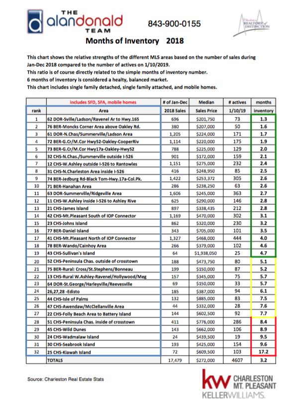
As the chart reveals, nearly 60% (19 of 32) of the MLS areas have less than five months of inventory. Overall, the Charleston Metro area is at 3.2 MOI, a clear "seller's" market, especially in the 19 areas showing less than 5 MOI.
Some higher-priced areas such as Kiawah and Seabrook Islands, Wild Dunes and Downtown Charleston inside the Crosstown are in a "buyer's" market.
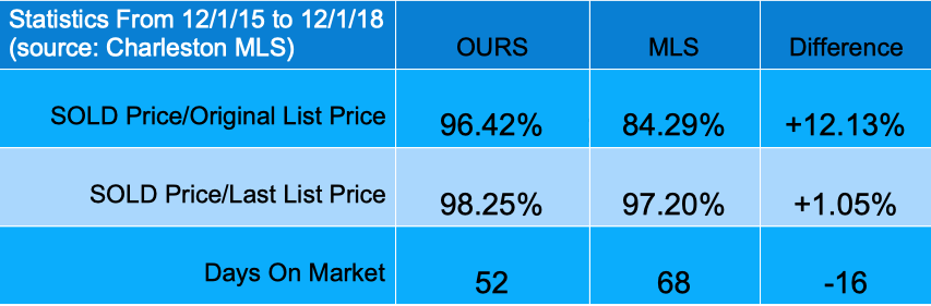
Why Hire Us?
Our advanced technology, market experience and detailed marketing lets us show a proven track record of netting MORE MONEY in LESS TIME for our listing clients. The following statistics are taken from the MLS for the period 2015-2018:
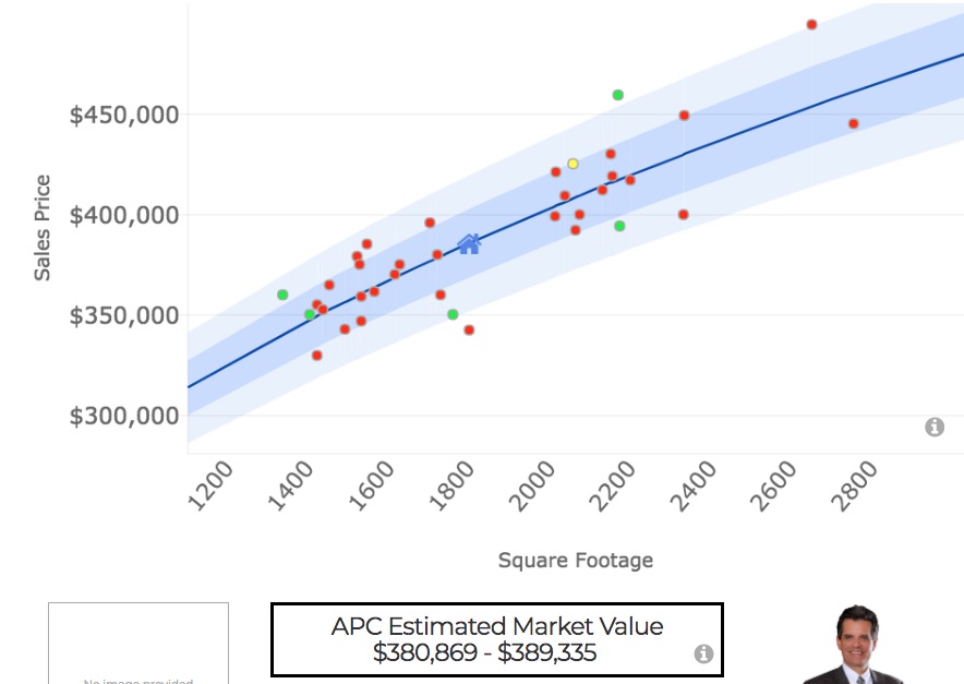
Where does YOUR Home fit within your neighborhood?
At Keller Williams Realty we use the most sophisticated and advanced tool available to position homes.
The APC Chart (click to view an interactive sample) lets you figure out VISUALLY how your home would be perceived by buyers in case you decide to sell, and it also provides for PRICE SENSITIVITY for improvements and upgrades to your home (e.g. answers to questions such as "how much more would I get if I were to renovate my kitchen, bathrooms and flooring?"). Click Here to request a free, no-obligation APC Chart for your home.